
Top Emerging Trends In App UI Design (2025 OUTLOOK)
08/11/2022
2.83k
While an app is made with a specific group of people in mind, that is, people who have a problem that the app solves, its user interface has to consider the existence of several sub-groups within that group. UI designers have to ask themselves a wide range of questions, such as: “Does everyone understand what a certain symbol means?” “Could there be an end-user who is blind?” “Will everyone be able to see this button or read this language?”
On top of that, they also have to consider business interests like branding and cost efficiency. So, how are they getting better at harmonizing all this? To answer that, let’s discuss the emerging trends in app UI design through the SupremeTech article.
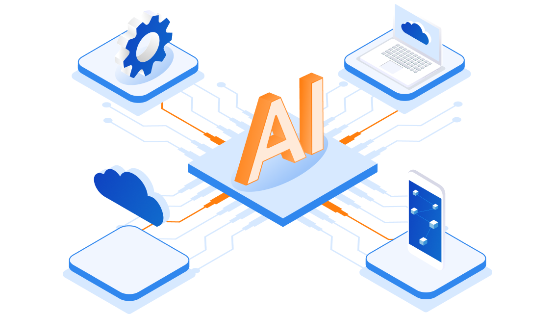
Augmented Reality (AR)
AR is gradually becoming a more common aspect of various app UIs, particularly because of its wide range of possibilities when using real graphics to communicate. This technology shows that you can communicate quickly and induce different responses by superimposing extra graphics onto an image or video of an actual entity captured.
For example, you can create something that’s funny because it’s not real, like showing yourself with dog ears or a flower crown. On the contrary, you can also create something that’s captivating because it’s almost real, like a view of your living room with a couch or your face with makeup.

AR gives you a chance to visualize elements you’d otherwise have to put together physically and does so with unprecedented accuracy such that the imaginary representation is as close to the real thing as possible. Some examples of excellent AR usage include Modiface, See My Fit/Virtual Catwalk, IKEA Studio, Amazon Salon, Snapchat, Gucci Sneaker Garage, View in Room and Asian Paints.
Voice UI
Technically, Voice UI isn’t entirely new. For a while, many software tools could respond to commands with something like an error message or instruction in audio form. However, what’s changed recently is that thanks to artificial intelligence, users can converse with the software on a device.
This is already in use with Google Assistant, Siri and Alexa, but there’s still room to expand. For example, designers can create interfaces that automatically pick up ambient noise in a room and use it as a guideline for adjusting music volume or as a trigger for something else, like a display of birthday party graphics and lighting when a crowd yells “Surprise.”
Virtual Reality (VR)
VR takes the concept of visualization one step further by immersing you into the space you’re viewing rather than simply pasting it onto a screen. It enables you to perceive dimensional changes when you move within a space, like an object getting closer or farther away.

It’s one thing seeing an object at the end of a room on a screen while being told the length and width of the room. However, it’s totally different when you’re actually in the room. You’re no longer trying to extrapolate from a smaller image on a screen that is also a certain distance away from your eyes.
VR’s capabilities are handy when trying to remotely touring a house. Moreover, it is about more than just viewing objects. VR can be used to relay commands that involve body movements, which makes it ideal for use cases like rehearsing a surgical procedure or assembling and repairing an intricate machine.
Some good VR apps include Provata VR, Space Explorers, Tilt Brush, and Gravity Sketch. VR is also common in the gaming world.
>>> Maybe you are interested:
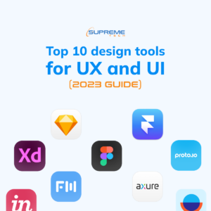
- Top 10 Design Tools For UX And UI (2025 GUIDE)
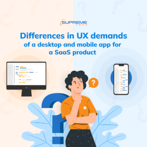
- Differences In UX Demands Of A Desktop And Mobile App For A SaaS Product
- Atomic Design In Software Development
Haptic Feedback
Haptic Feedback is designed to address a user through their sense of touch. In that sense, haptic feedback messages are usually conveyed as vibrations within the device a user handles. Initially, this technology was used in a basic manner, like notifying someone that they are being called if their phone is in silent mode or that they’ve chosen the right or wrong option on a screen.
Later, it advanced into an exciting way to keep a user engaged by trying to simulate what it’s like to be in a particular situation, like the rattle in a car when it leaves a smooth tarmac track and goes off-road onto a rough and bumpy Murram strip. This use case has been prevalent in gaming controllers.
Nevertheless, haptic feedback continues to evolve, with companies like NewHaptic using this technology to create fluid Braille touch screens that use tactile pixels (taxes). Clearly, haptic feedback could be a great tool for making apps more accessible to people with disabilities.
Additional trends
Many other UI trends are impressive, even though they may not have the most significant impact on user behavior. These include a dark mode, flat UI, glass morphism, metamorphism, animated illustrations, buttonless design and minimalism, asymmetrical layouts, and more.
Ultimately, UI is an intersection of expression and technology, which means many designers will come across the same concepts, but the difference will be in execution. On that note, here are a few questions to answer before you jump onto a UI trend:
- Does it make life any easier for the user, or is it merely a fancy nice-to-have?
- What does it say about your brand? (futuristic, sleek, nostalgic, sexy, young and vibrant, sophisticated etc.)
- How much computing resources does it require? (Will it end up slowing down the app and making it heavier, or will everything still run smoothly)
- Is it inclusive, or does it speak to the strengths of a few while sidelining many who have a specific weakness?
- How much money will it cost to install and maintain?
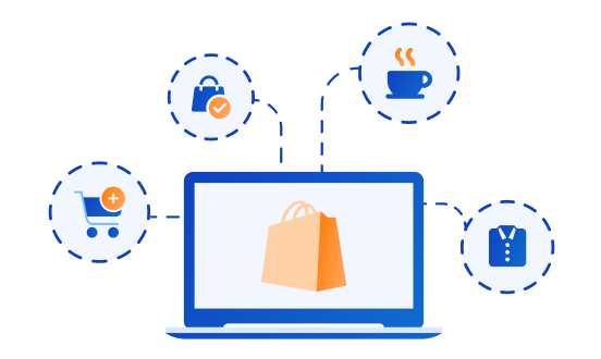
Lastly, remember that UI design goes hand-in-hand with many other elements of a software product. For instance, an e-commerce app’s item display may require a slider to see different angles of a product, while a fitness app may only need a thumbnail for each workout.
There are other considerations, like whether the subtle tones of neomorphic buttons would work well for a CTA, which usually needs to stand out.
Wrapping Up
UI design is a far-reaching aspect of app development that often requires various team members’ input. This can be tricky to execute while responding to changes in user demands and other project challenges during the development lifecycle. If you need professional guidance on addressing every facet of app UI design, contact us for a free consultation.